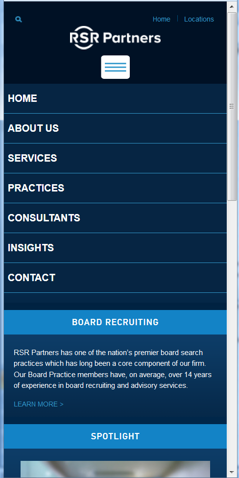
Responsive | Mobile | Tablet Design
For many companies, the majority of web site traffic comes from mobile devices and they need a “responsive theme.” A responsive theme changes the menu system as the web site viewing area decreases or increases for different mobile devices such as, tablets and smart phones.
In addition to changing the menu system, a responsive theme will modify the layout grid and re-size the graphics to match the user’s device. Due to the boom in mobile devices, the design for mobile users is just as important as your desktop web site design.
Visit the desktop version of a responsive website developed by Events Online »
Click the images below to see the responsive look of the RSR Partners web site.
-

- Smart Phone View

-
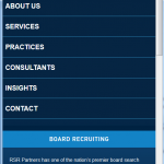
- Smart Phone Menus